
DR SANNAS
DR SANNAS
The beauty of natural intelligence
The beauty of natural intelligence
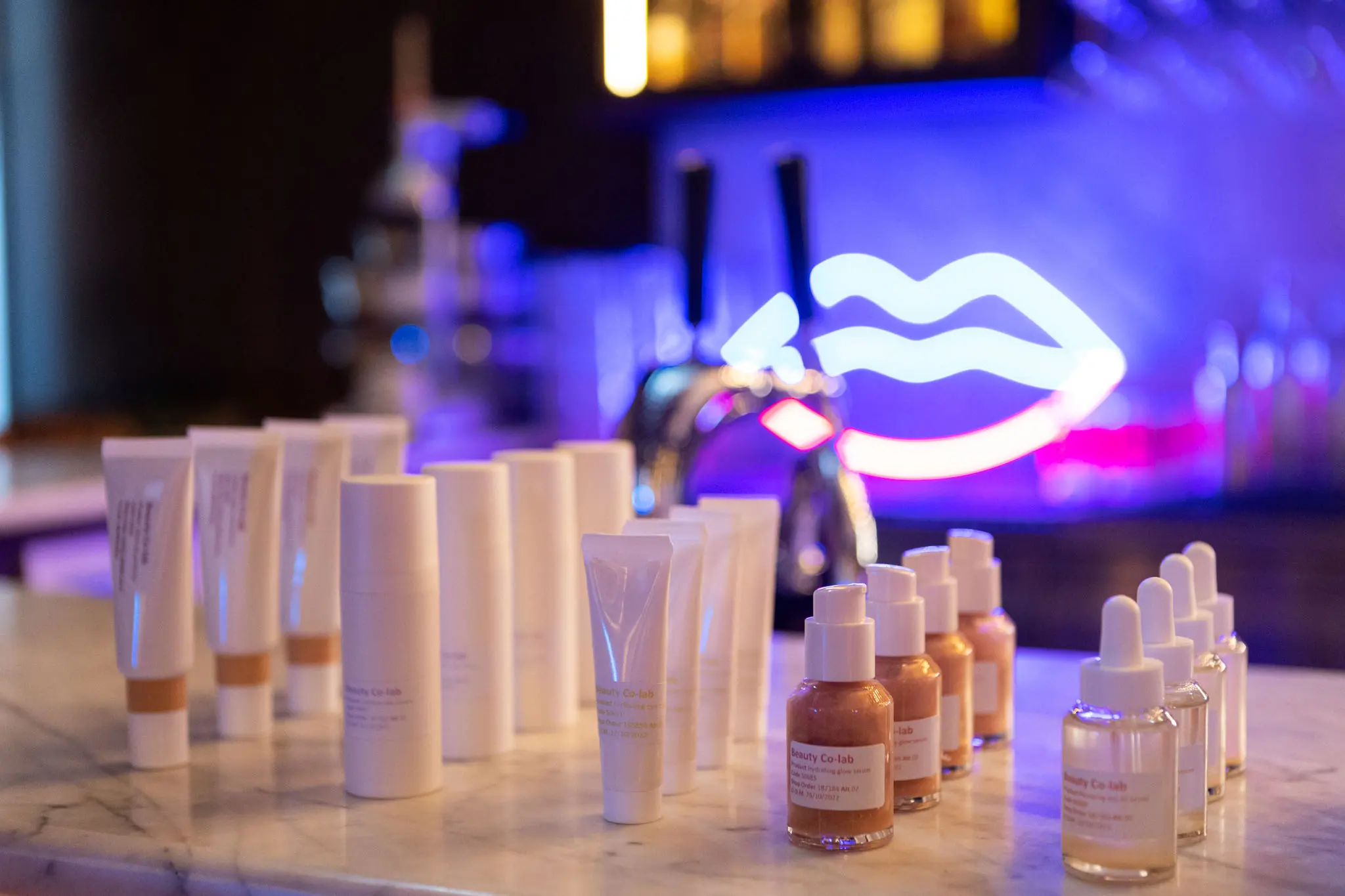
Built around organic ingredients, herbal knowledge and botanical craftsmanship, Dr Sannas called for a more tactile and emotionally driven approach to beauty. We developed a new brand identity and packaging system based on the idea that the opposite of artificial intelligence can be found in nature. This philosophy shaped a contemporary brand world of botanical materials, handcrafted details and organic imperfections.
Built around organic ingredients, herbal knowledge and botanical craftsmanship, Dr Sannas called for a more tactile and emotionally driven approach to beauty. We developed a new brand identity and packaging system based on the idea that the opposite of artificial intelligence can be found in nature. This philosophy shaped a contemporary brand world of botanical materials, handcrafted details and organic imperfections.


Inspired by botanical craftsmanship
Inspired by botanical craftsmanship
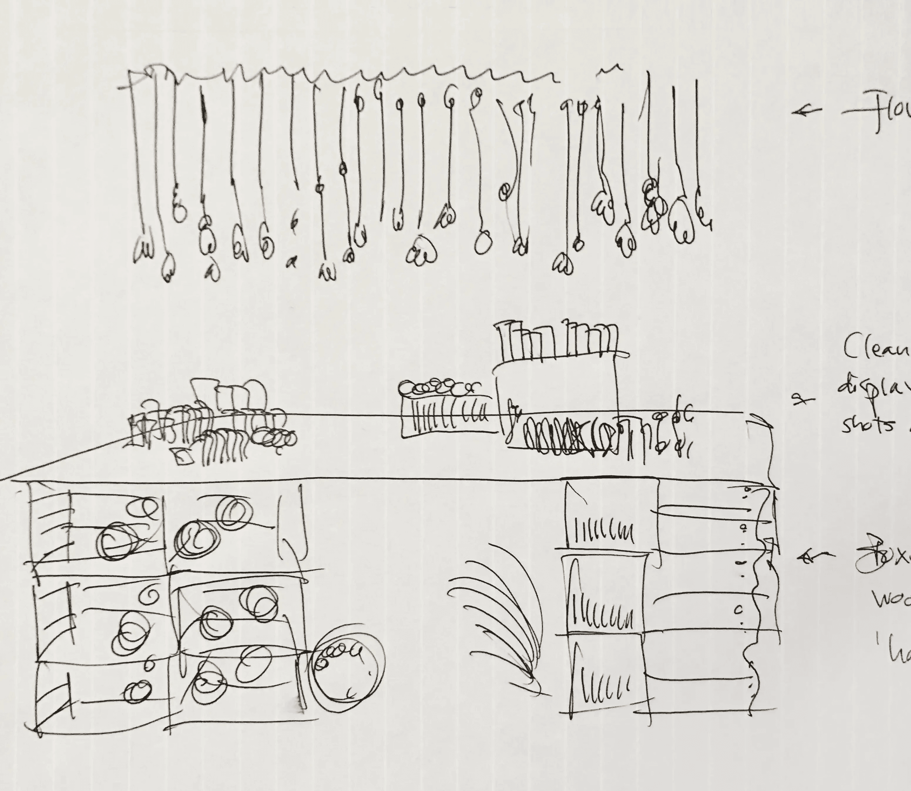
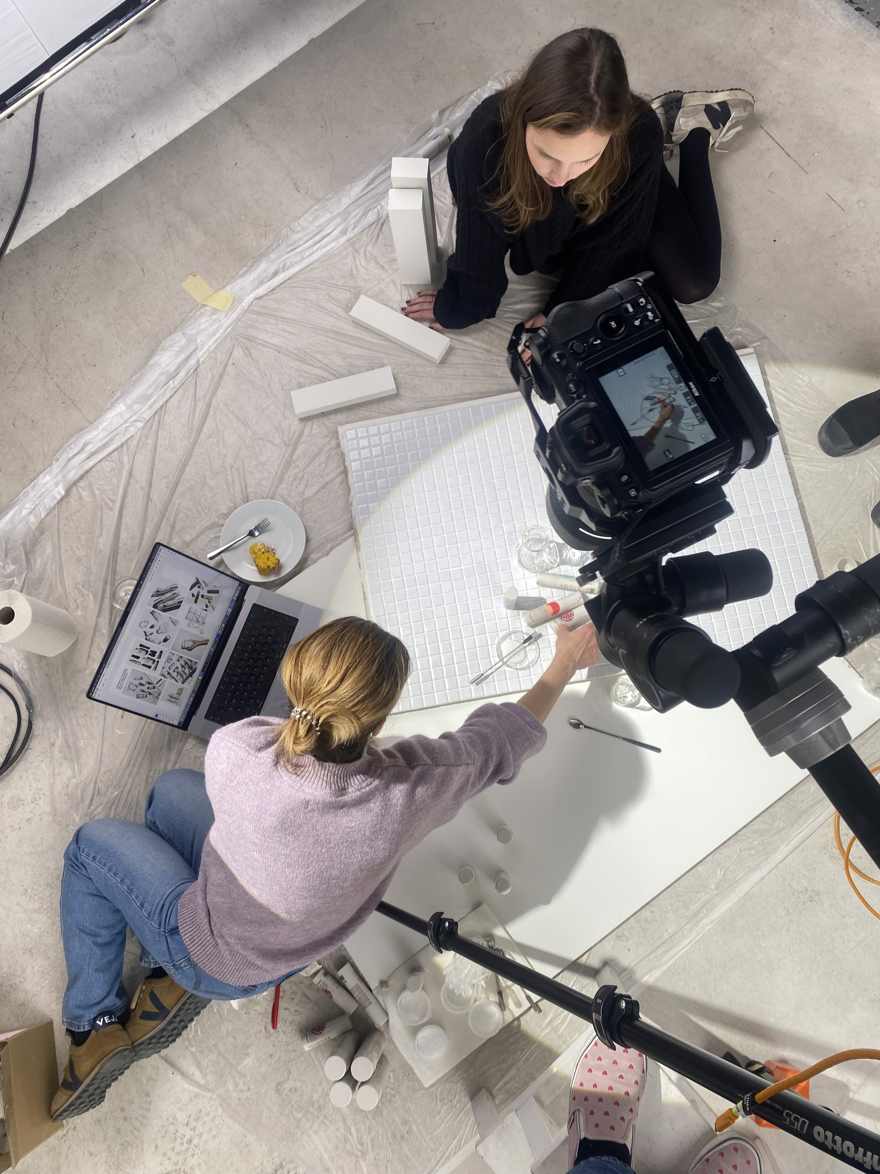
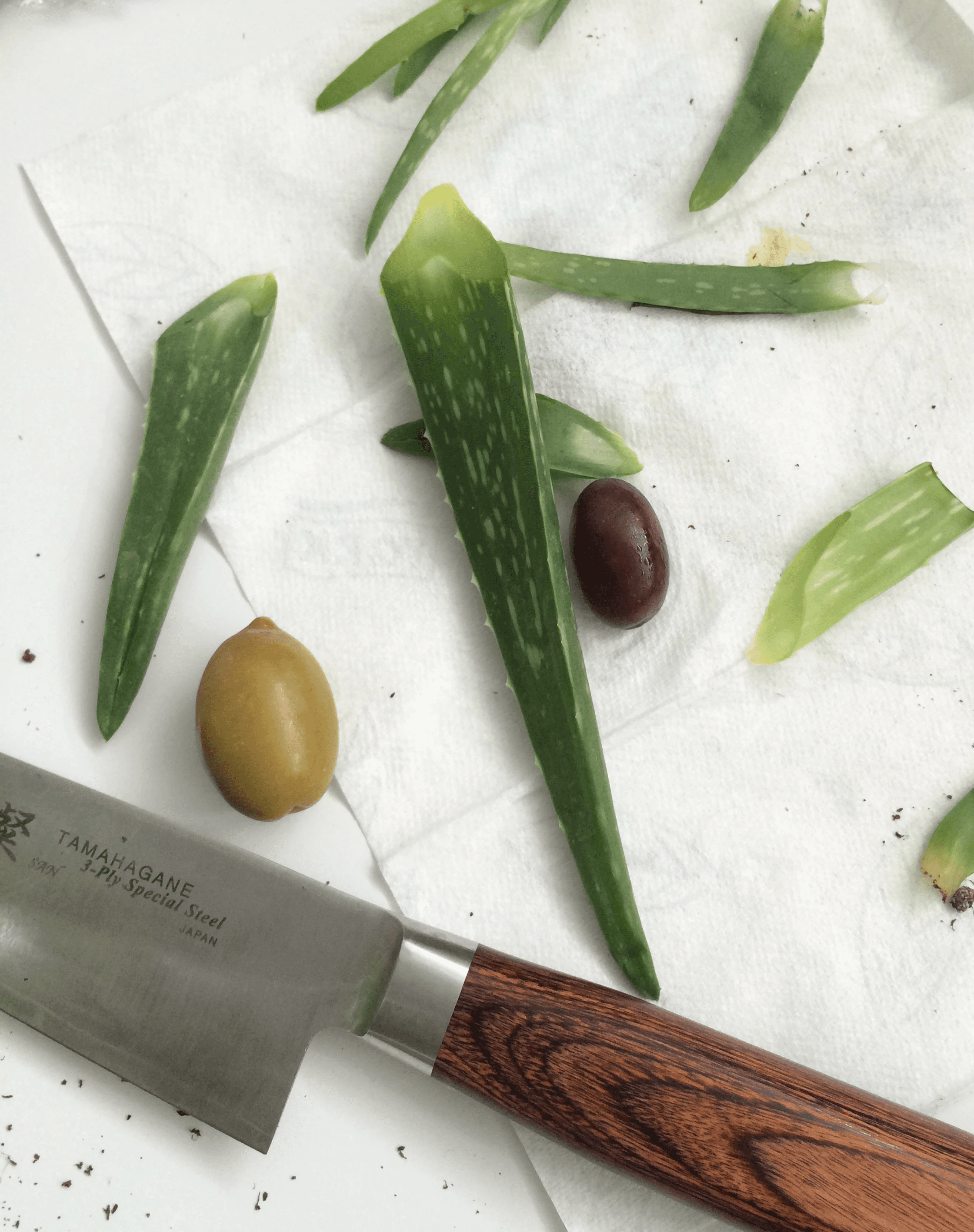
Flowers, herbs and natural materials became physical tools throughout the creative process, allowing their shapes and textures to become part of the visual language.
Flowers, herbs and natural materials became physical tools throughout the creative process, allowing their shapes and textures to become part of the visual language.


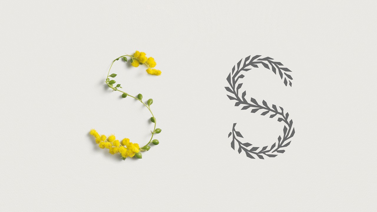
Nature itself became a carrier of communication, with a custom alphabet made from real flowers and plants and designed to evolve organically with the seasons.
Nature itself became a carrier of communication, with a custom alphabet made from real flowers and plants and designed to evolve organically with the seasons.


Shaped by seasons and materials
Shaped by seasons and materials
The visual identity drew inspiration from botanical archives, herbal medicine and apothecary traditions. Delicate illustrations, understated typography and tactile packaging details were combined to create a skincare expression that felt deeply rooted in nature.
The visual identity drew inspiration from botanical archives, herbal medicine and apothecary traditions. Delicate illustrations, understated typography and tactile packaging details were combined to create a skincare expression that felt deeply rooted in nature.

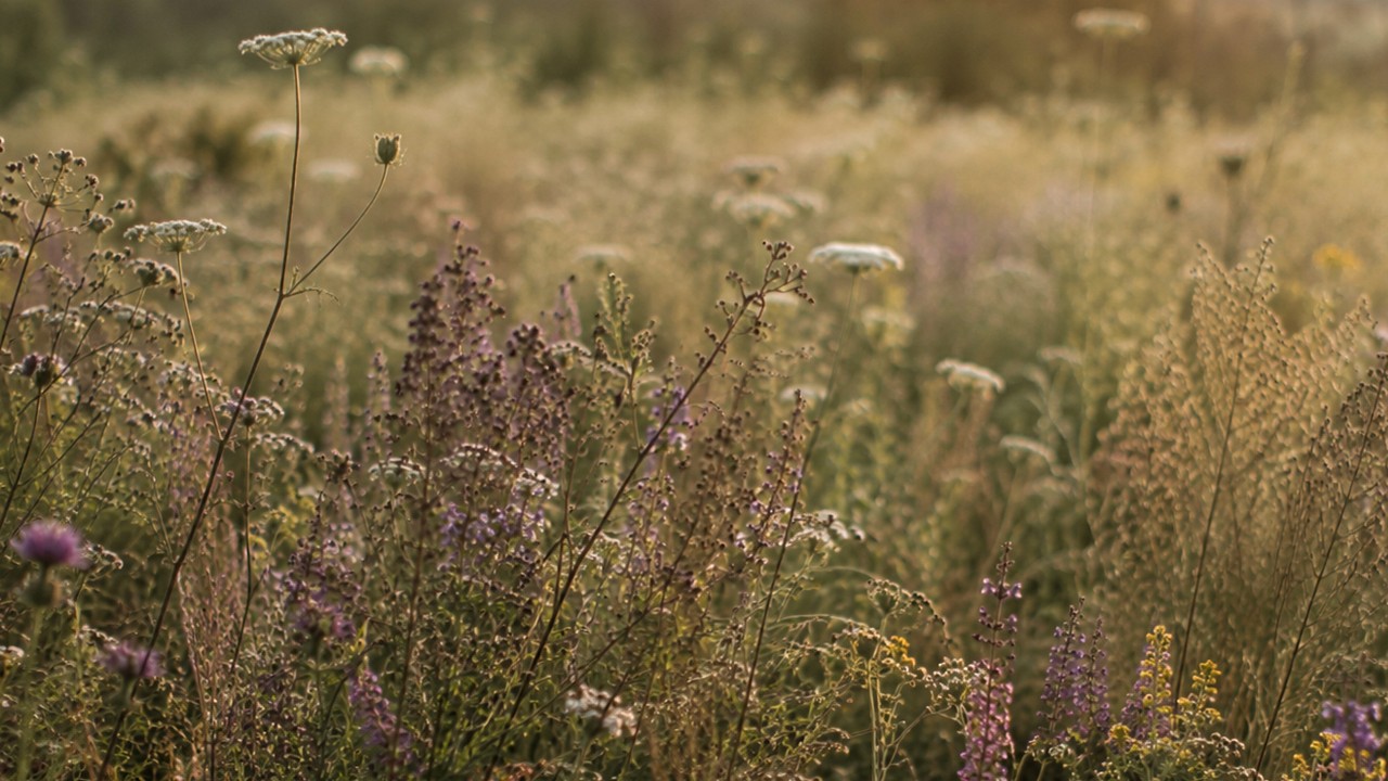
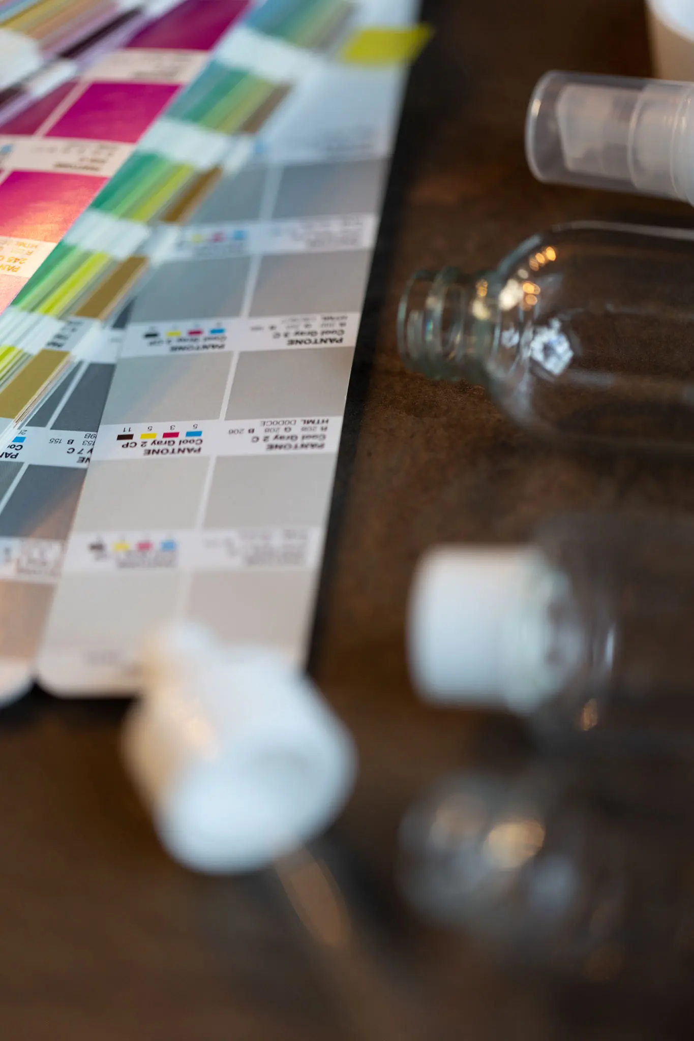
Inspired by botanical pigments and natural color variations, the palette combined muted earthy tones and faded shades to create a raw and tactile expression.
Inspired by botanical pigments and natural color variations, the palette combined muted earthy tones and faded shades to create a raw and tactile expression.


The new identity brought Dr Sannas back to its roots in nature and herbal traditions, translating them into a contemporary context. The redesign resonated strongly with consumers and gave the brand renewed relevance.
The new identity brought Dr Sannas back to its roots in nature and herbal traditions, translating them into a contemporary context. The redesign resonated strongly with consumers and gave the brand renewed relevance.
DELIVERABLES
Brand platform
Brand identity
Design strategy
Packaging design
Illustration
DELIVERABLES
Brand platform
Brand identity
Design strategy
Packaging design
Illustration
COLLABORATORS
Photography
Robert Berglund
COLLABORATORS
Photography
Robert Berglund







STUDIO LOCATION
Skeppsbron 38
111 30 Stockholm, Sweden
NEW CLIENTS
CREATIVE COLLABORATIONS
STUDIO LOCATION
Skeppsbron 38
111 30 Stockholm, Sweden
NEW CLIENTS
CREATIVE COLLABORATIONS
STUDIO LOCATION
Skeppsbron 38
111 30 Stockholm, Sweden
NEW CLIENTS
CREATIVE COLLABORATIONS